In what ways does your media product use, develop or challenge forms and conventions of real media products?
My front cover develops some conventional magazine cover ideas. Like most magazine covers it has the masthead at the top of the page in a bigger font than the rest of the text on the page. I also have a strapline underneath it which is another conventional idea. As I have both of these in different fonts I am developing media conventions. Another conventional thing to do is to have cover lines on the front cover. My cover lines and kickers are in a different font from my masthead and my strapline. This is done a lot in magazines, using 3 or 4 fonts for their front cover. I also have a model on the front of my magazine cover, as she is not a well known model I have not named her. Magazines name all models that are on their front cover and often have an article about them inside the magazine. I do not do that so my magazine challenges conventional magazine ideas. Another way I develop conventional media ideas is by having a dateline on my magazine; my dateline is just the month and year so this shows that my magazine is a monthly magazine.
Another way I challenge conventional magazine ideas is by not having a barcode or a price. This is because my magazine is a school magazine and it is rare for a school magazine to have a barcode. Also school magazine often don’t have a price on them. That is why mine does not have them and is why I am challenging conventional media ideas.
On my contents page I develop conventional media ideas by having my cover stories listed under a heading cover stories and also having a section for my regulars. I also have images which can be a conventional thing to do. A non conventional thing to do is have no text to describe my stories or cover lines. All I have to describe my stories are the images, I also only mention my cover stories and regulars, I do not mention any other articles which are in my magazine. That is an unconventional thing to do. I do not have text because I think the cover story title and picture explain enough as is, and I do not have the rest of the articles in my magazine listed because, although they are important, this issue of the magazine is about the cover stories and the regulars, they are the main thing in my magazine so the only thing that are mentioned on my TOC.
How does your media product represent particular social groups?
The font for my masthead and strapline are both different forms of an urban style font, but my cover lines and model show a more professional look, so my cover appeals to many different social group. Because of the articles on my magazine cover and the model it is appealing at 6th form students, probably those in a high achieving 6th form because she is dressed smart.
What kind of media institution might distribute your media product and why?
The school my magazine is for would be the school which would distribute my magazine, because my magazine IS a school magazine. Because it is about a specific school, that school will distribute most copies. This magazine may also be distributed at other schools, mainly aimed at children in year’s 6 and year 11 because they are looking for a new school so may want to know about what is happening in that school so would want read a magazine about it.
Who would be the audience for your media product?
My audience would primarily be the students in the school my magazine is made for, especially those in sixth form. It would also be aimed at students in different schools who want to find out more about this school, so this magazine needs to appeal to students ranged from 11-18, mainly those aged 16-18.
How did you attract/address your audience
Some of my cover stories are aimed at people who are in the school “What not to wear”. This is aimed at my target audience of 16-18 because it is talking about the dress code which they all have to follow. My other cover stories “Too much homework” and “Free time” are aimed at all students, which is my audience of 11-18. My magazine addresses my target audience of 11-18 by mentioning events happening at the school. This can be shown by my regular called “Events”. It also shows addresses that target audience by showing them what is happening in their school at the moment “Latest News”. It further attracts my target audience by having regulars “Letters” and “advice corner” because it gives them a chance to voice their opinion and also to see what other people, like them, are saying.
Friday, 12 December 2008
Tuesday, 2 December 2008
Second Photoshoot Plan
 This is the plan for my second photoshoot, i need to do a second one to get images for my Table of contents, at the moment i have second hand images, so i need to take my own images to replace these.
Monday, 1 December 2008
Table Of Contents
 Using my table of contents mock up, i started to design my table of contents. I added in my images, my cover story names and my regularrs etc... Whilst doing this i decided to not add in the explanatory text and just have the images describe my cover and regular stories. Once i had finished editing this i also added a background to my table of contents.
First Draft Of Front Cover
After creating a mock up, i started to work on making my image in for my front cover in photoshop. There i edited my images and started to add in my cover stories etc... After they were all done, and i chose the right fonts and composed it so it all lined up i came up with a finished front cover for my magazine. 
Friday, 21 November 2008
Contents Page

We then started designing our contents page. For this we used microsoft publisher and then started to design what we were going to do for it.
Once we had finished this design we analysed it
Friday, 14 November 2008

Thursday, 13 November 2008
School Cover


This was the picture that came from my plan, with the school behind the students. I will clone out the tree at the side and then clone out the alarm system at the top left-hand corner of the page.
I will also use one of my other editing tools to remove the whole background so I can insert different ones.
The problems with this take were that we were told to take a medium close up (MCU) but instead we took a medium shot.
Now with our images we are going to edit them in Photoshop to get them ready for our magazine front cover.
In our next lesson we started taking our magazine covers. First we made a plan of what we wanted to take our picture of then we started to take them.
School Magazine Covers

Rather than just analysing these magazines we commented on their pro’s and con’s. What we liked about than and what we didn’t. This was because we were going to start work on our own school magazine later so wanted to see what we liked about school magazines and if we could be inspired.
The pro’s of the magazine on the left are that it shows that it clearly is a media magazine and has images showing that. A con is that the images aren’t placed as well as they could have been using the rule of third and also that the main colour of the cover isn’t that eye catching.
In the picture on the left one of the pros is that it shows a variety of the students face.
Logo's And Banners


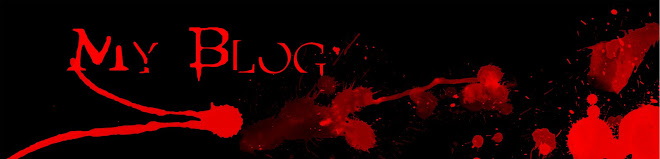
We then learnt about logos and banners and how we could create our own banner. To do this we opened up adobe elements and opened a new blank project, from there we opened up a page using the preset A3 so we now had a blank A3 page. First I changed the background colour to black using the fill tool; I then opened up a new layer and started to design my banner on there. For our banners we used different types of brushes, this meant we needed to download more brushes for adobe elements. To do this first we had to find a website which had brushes. I chose to use http://www.brusheezy.com/ to get my brushes from and chose to use the brush called “More drips and splats”. I loaded this brush into adobe elements and used it on my new layer. Once I had arranged them in a way that I liked, I then added in text that this was my blog because I was going to use this logo for my blog. Once I had finished this I opened a new page and used the same A3 preset. I then did the as with my logo, I made my blank page black, added a new layer then loaded the “More drips and splats” brush. I then used this brush on the top of my page only. I added in a text saying “My blog” I then cropped off the bottom of the page leaving just the top to use as my banner for my blog.
Signs + Semiotics

In our next lesson we started to learn about signs and semiotics. We learnt that there are 3 kinds of semiotics
1. Icon – Look like what they represent
2. Symbol – Need to be culturally learned. They do not look like what they represent
3. Indexical – Suggestive and connected to what they represent
Airbrushing

In our next lesson we learnt about airbrushing, changing eye colour and hair colour. To do this we opened up our image in Adobe Photoshop elements. First we duplicated our original image then applied a Gaussian blur to that image, this blur varies depending on the image you work on, and for the above image my blur was around 28 pixels. Once you have blurred it, you then erase the eyes, the eyebrows, the mouth etc… to make sure they don’t look wrong. The blur is to remove blemishes and make the skin look clean.
Once you have done this first step, you then work on the eyes. For this you open up a new layer then cover over the eyes in your desired colour. Once you have gone over the eyes you change the layer affect to soft light, change the opacity down to around 60 or 70. Then you erase any areas of this that may have gone over the actual eye to make it look more real. You then can apply a Gaussian blur to this to make it more real.
The same steps are taken for the hair.
Once you have done this you get your final image.
Monday, 10 November 2008
Colouring Effect


Colouring Effect
The colour effect is what I learnt in my next lessons. To do this we opened our image in Photoshop. Once we opened it we turned the saturation down to around -80. We then opened a new layer and turned the effect onto soft light. Once we had done that we chose any colour we wanted, clicked on our brush tool, picked a hard brush then went over what we wanted to be that colour. In the case of the above picture I chose to do these in diagonals. I continued to draw over my image in a certain colour till my entire image was covered. This didn’t look that good or professional so the next step was to click on the heading filter, then blur and then Gaussian blur. Once we had clicked on that we turned the blur amount to around 85.
Once this was done I edited the image by adding in text.
This colour correctional tool can be used for fashion images etc…

In our next lesson we talked about fonts and how important they are. We talked about serif fonts and sans fonts. Sans fonts are better for title’s and something you see from far away. Any sans font works for something you see from far away. Sans font however is not that good or appropriate for long bits of text, it’s not that clear to read. Serif fonts are not good for posters  or titles, but work better for long masses of text because they are easier to read then.
We learnt about how to download different fonts and also make fonts appropriate for whatever we are trying to advertise or talk about.
A good site to download fonts from is http://www.1001freefonts.com/
In The picture on the left the font there is an army font which makes you think that whatever is going on in this poster is something to do with the army of being in control as in a leader. It is a little worn away and grungy. This gives the idea that this font is hard so whatever it is talking about is a strong thing (in this case it is suggesting that Obama is a strong presidential character.) or titles, but work better for long masses of text because they are easier to read then.
We learnt about how to download different fonts and also make fonts appropriate for whatever we are trying to advertise or talk about.
A good site to download fonts from is http://www.1001freefonts.com/
The colour of the text is also important, the colours in the image are red, white and blue which are the symbols for America. In this picture they are saying that Obama is a symbol for America.
Colour Popping

 Colour Filtering/Colour Popping
Colour popping is where we make a certain colour stand out compared to all the others. This is a technique I learnt in my second lesson. This technique helps for posters when you want to make something or someone stand out in a picture. You don’t want to focus just have them in the picture but you want to make sure the audience focus’ on them more. To do this we used adobe Photoshop elements. We opened up our images on there then we turned the saturation down to -100 first, this then created a new layer of the image which was black and white. We then clicked on our brush tool, then colour correction. Once we had done this we used the colour correction brush over all the areas we wanted to have in black and white. This meant we had to be careful not to go over anything we wanted to be in colour. Once we had gone over everything we wanted to be in black and white, we saved our images. This meant on our final images we had made a certain person or something stand out. This technique is often used to make one colour stay in the image so. (i.e. the Marylebone picture above with only the green left in). It is also used to make a certain thing stand out (i.e. The beware theft image only shows the person stealing in colour which makes that stand out or pop out of the image.)
Image Analysis

At the start of this course we did some image analysis.
Because this character is at the front and in the centre, it suggests that he is the main character
The Characters Are The Only things in the poster and draw us in
The Only Information Needed
This is a poster for Pirates Of The Caribbean. In this poster it contains all the title characters, the films name and logo. Above the film name it also has the logo for the company who are making the film. All of the characters are surrounded by mist. This brings up the connotations that the film could contain mystery and the unknown. The character at the front is carrying a sword, (and the other characters are seemingly getting their weapons) so this can bring up the connotation of violence that the film probably contains violence. The colours are quite dark which suggests that the film is quite a dark film so possibly not for the faint of heart. There is a text at the bottom of the poster in the centre which just says the date “In Theatres May 25”. This now gives the audience a date as to when the film will be in cinemas without saying it will be released then. This means the poster doesn’t have too many words obstructing the image or getting in the way of any of the characters present.
The camera angle is a medium shot, which only shows the characters waists and up. This avoids showing too much of the characters. If this had shown all of the characters bodies we may have been distracted or lost sight of it. Also it would mean it would need more mist to create a sense of mystery which could possibly overtake the poster.
The characters and the mist all contribute to the mise en scene. The characters do not overlap each other so we can see them all clearly. It also shows all of the main characters in the film, these are also the celebrities we recognise so that could get the reader to want to go and see the film. The mist only covers a bit of the characters which does show a sense of mystery but doesn’t take away attention from the characters which are the focal point of this image.
Blog Introduction
This blog is backdated with my media work that i have been doing. I will be posting a number of blogs stating what i have done in media this year
Subscribe to:
Comments (Atom)