
Wednesday 31 March 2010
Website Plan
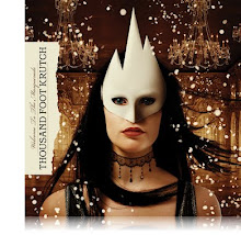
 This is my plan for my website. It follows conventions because it has my poster as the main image. As with other conventions, my title is the biggest text on the page. The tag line is also there in a bigger size than most of the text.
 I don't have the date of my films release on there but that is because it's in the trailer. I also have the links and billing box which follows conventions.
The background will be the same style/feel that my poster is, with the image having the same grunge background which fades into a black background.
Website Analysis 2

This is the website for remember me. Genre wise it's similar to mine as one of the main theme's is romance. This website follows conventions as it has the title as the biggest text on the page. As it's in red it stands out from the rest of the background which is in black and white. The release date for the trailer is also in a bigger text than most of the text on the page but smaller than the title. The background image is the same image as is used for the poster for the film, but the trailer overlays it and takes up the majority of the page.
Following conventions the social networking links are on the page but instead of being on the bottom of the page as is conventions, they are on the right side of the page.
Following conventions it has links to the story and gallery as fans or audiences would want to know about that if they are going to see the film.
The stars names are also listed on this poster which isn't done on the kick-ass website. This is a convention that is often done if your film features well known names. As the main star in this is robert pattinson then his name will be on there as he's a reason to watch the film. As my film has unknowns in it, i do not add the actors' names on mine, only in the billing box.

Website Analysis

This is the website for Kick-Ass. The genre is different from mine though love does play a role in this film as too their being some kind of conflict. Despite the genre being different though, the target audience is similar. Both mine and their film are aimed at predominantly teenagers aged 15+ but also accessible and aimed at adults.
In terms of the film poster and it's conventions, The film poster has the name of the film as the main thing you see. It then has the main characters head's in the gap between the words kick and ass, changing from one to the others after a given time. The date is also in a big font so you know when it's coming out with the social networking buttons near the bottom of the page as are conventions of a movie website.
The trailer plays automatically, with the option for people to close it and actually enter the site. As well as following those conventions, it has a place when you can register for the mailing list at the bottom of the site.
In terms of being like the poster, it is very similar as it has the same grunge feeling. The characters heads are surrounded by spray paint as on similar posters they have.

Thursday 18 March 2010
Teaser Trailer: Welcome To The Masquerade
Info about my trailer, well there's not much to say. It was difficult to make at times but nevertheless i managed to get through it. Don't know how to introduce my trailer except something i quite enjoy.
http://www.youtube.com/watch?v=Px7swEPf0ss
Website Design
I based my website design and followed conventions about how to design it (Will be updated onto the blog later).
The design was primarily based on Nightmare on Elm streets website, which has the same image of as the poster on the left side of the page with the various buttons and trailers on the right. I also added on social networking buttons
Wednesday 10 March 2010

Movie Poster

The billing box was made in reference to other film movie posters like the dark knight and shutter island. It uses a steel tongs font while the rest of my poster uses the font "Northwood High". The background is grungy with the polaroid's also having a grungy/aged feel to them. They are arranged in a collage with the one of aisling in the mask on the top of the pile. As it's roughly in the centre and in colour it will get
Movie Poster Update
My initial idea for my movie poster was to use a similar idea to the face off movie poster, where half the poster was one persons face and other half was another persons face. This proved difficult to do so i needed a change in plan for my movie poster. I searched for other movie posters etc... for more inspiration. While looking i found a couple of interesting idea's based around polaroids. This appealed to me as i could show multiple images on one poster to convey different parts of my movie. I then made a new poster plan for my polaroid inspired movie poster.


Unlike these posters having hands coming out and holding other polaroids, i chose not to do this as it doesn't apply to my film that well. The pictures i'm using are to suggest pictures used would take in the masquerade of just in general.
Unlike these posters having hands coming out and holding other polaroids, i chose not to do this as it doesn't apply to my film that well. The pictures i'm using are to suggest pictures used would take in the masquerade of just in general.
Subscribe to:
Posts (Atom)