So Far
This week was the week that i started working on my teaser trailer. I am working on my own
so have found both good points and bad points about it. The bad is that it's a lot more work for me ande i have to be very organised to be on top of everything. The good is that i only have to check with me for what i want to add into my teaser etc... Also It means im not dependant on other people finishing things like story boards etc...
Over the week i finished work on my storyboard, planning all of my teaser trailer show by shot in accordance with my teaser plan. Some scene's though may change due to what it actually do-able and also for what would make the teaser seem more appealing (for example some scenes in the final montage could possibly change to more action filled ones).
I will be starting work on my animatic next week so i can get an even clearer picture of how my teaser trailer will look.
In terms of finding actors, I have asked and got people willling to play the parts and have also been finding dates they are available. Last weekend i was able to film with two of my main characters as well as being able to film some on wednesday. On the 19th of december i am planning on shooting my masquerade scene.
Last weekend the filming was going to be shooting the majority of the ending montage, but due to unforseen circumstances (illness' etc) i had to limit the number of shots i could do. I had however already planned for this by penciling in dates to film over the christmas holidays if need be.
With my actors last weekend i filmed some of the chase scene's that they'd be in at different angles and different stages of the chase. As i had more time due to having to shoot less shots, i was able to use them to test out other shots i had planned. Last wednesday i was able to use the barbican as the setting there was good for my trailer, i also had some of my actors there so was able to film some there.
Upcoming Plans
This weekend i am planning on testing out some more shots and experimenting with the camera. This sunday I may also shoot some montage shots for the end of the film (weather permitting)
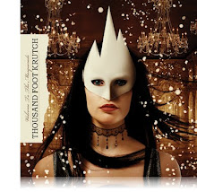
I am planning on doing (or starting) my animatic this week as well as trying to sort out music for my trailer. I was planning on using a specific song for my trailer, ("The Inviation" and "Welcome To The Masquerade" both by Thousand Foot Krutch") But as they are copyrighted i need to seek an alternative.
As my song is changing the tone of my teaser may also change, the scenes will be the same but the order may change
As well as sorting that out i need to finalize plans for the 19th and make sure i get as many actors as possible.
I'll be seeing more of my actors on tuesday so will be trying to do some filming then as well as practicing my camera work by filming the school musical.
I will also be seeing if my actors are available on thursday to get some more of the montage scene's done.
Friday, 4 December 2009
Friday, 23 October 2009
Welcome To The Masquerade Teaser Trailer Plan
Teaser Plan
ECU of Main character’s Venetian/Masquerade mask lying on a table, sharp focus on it with the rest of the items on the table are in soft focus. The camera pans out till it’s just a CU of the characters mask rather than an ECU. The main character’s hand then comes into shot and grabs the mask
Cut to the back of his head as he puts on the Mask, his head is currently focused down, as he finishes tying his mask or just applying it to his face he looks up. There is a mirror in front of him but it’s in soft focus so his face in unclear for now.
Previous shot fades into a MS of him doing up his waistcoat. The camera pans up his waistcoat slowly till we get to a CU of his face with the mask on
While the camera is panning up the music will play a series of beats quickly, during these fast beats there will be fast cuts of CU’s of various characters in the film showing their facial expression. This first montage of aces will show them all with smiles or happy faces.
After the fast cuts the scene will return to panning up his waistcoat to get to his mask. Once at a CU of his mask. The shot will then zoom in
As the shot is zooming in another series of fast beats will happen. This time the same character’s faces will appear on screen but either with a more aggressive face or some with masks on. These shots will again be in CU
After the series of fast beats the scene will return to a CU of the characters face before fading into a LS of him
The LS will be of the back of him as he is exiting the door aiming to exit the door
Another series of fast beats will play and this time all the characters will be wearing masks with CU shots of all of them.
The scene will then return to a LS of him walking out the door.
As he opens the door light increases from the door and soon the whole screen turns to white
The screen fades in from white to see a LS of him walking through the door into an open ball room.
The camera cuts to an over the shoulder shot focused in on the empty ball room. There is a girl in the middle dancing on her own. At first she is in soft focus but it changes to sharp focus with soft focus now on his shoulder. The shot will be slowly zooming into the girl
The scene’s will fade into a LS of the girl dancing on her own
A cut will then go a medium shot of her dancing, she was previously looking down at her feet and now is starting to notice him
Cut to a CU of his face with a mask on looking at her.
Cut to a CU of her looking at him seductively. Shot fades to white
Fade from white of a LS of the two dancing together in the middle, Shot fades into a MS of the two before fading into an ES of the two dancing in the open room.
Cut to a CU of him getting ready to spin her
Cut to her as she is spun
Cut to him pulling her back in, fades to white
Fades from white to reveal the rest of the party goers all their in fancy dress, LS.
Cuts back to the two dancing together
A montage then is played, shot’s will include:
LS of the main male character and his group of friends.
MS of some drunken party goers in a fight
CU of the main female character with her mother in the background in soft focus
MS of the main character and one of his friends arguing
CU of some of the masks falling to the ground
MS of various couples kissing
CU of the main male character running
CU of the main female character crying
Will then end with the title reveal, the film’s name “Welcome To The Masquerade” will slowly zoom into the camera then fade away like fog.
Visual Mood Board 2, Teaser Trailer Idea/Inspiration
Another Visual mood board
The music used in this teaser is the music i am going to use in my teaser trailer
The scene's used are similar to the idea and feel i am going through
I haven't used text yet but plan to in my trailer
Visual Mood Board
My Mood Board for media, the first few minutes are my experimenting with video editing of live action and also the idea of a teaser trailer, trying to sum up a lot of the film in just 1 minute
The rest of the video features images and music which are all inspiration for my teaser trailer
Friday, 2 October 2009


Tuesday, 28 April 2009
Monday, 27 April 2009


Thursday, 23 April 2009
Double Page Spread Edit
.jpg) A sublte change BUT one that had to be made none the less (the page number had to be edited)
A sublte change BUT one that had to be made none the less (the page number had to be edited)
Final Draft (re-done so not really final any more is it? but oh well)


Here are the steps i took to get to my FINAL final music magazine front cover, the final one is the one JUST above this
Thursday, 26 March 2009
Tuesday, 24 March 2009


Friday, 20 March 2009


Double Page Spread Second Draft
 This is my second draft of my double page spread. Here i changed my font for the articles. The title of the article is written in "ACID LABEL_" with the text underneath it and credits also written in the same font. This over laps the name of the band "rise against" which is written in "a bite" Both these fonts are grunge fonts so they fit in with the style of the magazine and the other grungy fonts used.
For the pull quote and the comments on the pictures i used my "defused font" which i have used throughout the whole magazine. All these fonts, minus the rise against one, are written in white font so they stand out from the "Rise Against" picture i used as a background.
Having a whole image to use as my background is breaking conventions. Normally there is a picture which takes up most of the background but not all of it. Despite this breaking conventions this has been used a number of times (for example look at my double page spread ananlysis of black tide).
I also used images of "The flobots" and "the king blues" and "Rise against" and added a border around them to make them stand out from the background. These also are pictures to do with some of the article as they are pictures from Rise Againsts "Appeal To Reason" Tour.
For my interview i used "Franklin gothic book" as it is a readable font. I surrounded the interview in a black box with a white outline, the whiteoutline used to make it stand out from the text, and then i used white for the font which were my interviewee's answers. I used red for the questions. This means they stand out from the black box background they have and are also recurring colours in my magazine. Also the red works well with the picture which is mainly of red but in a different shade.
For the actual text of the interview i used formal language, i also left it as it was. There were no edits to what he said (as can be seen by the use of words like "gonna" etc...) Also the way the interviewee speaks have not been edited, it may sometimes be bad grammar. "Is always hard, is annoying..." I have also included when the interviewee laughs. The text itself wraps around the picture showing that the picture is important.
My double page spread is arranged to form a "C-Line". Where the reader will first see the Title of the article, then will be drawn to the big pull quote, then from undernath the pull quote they will follow the trail of pictures back to the interview. This is working on how the eye naturally sees things. This time i put my text and pictures on an angle to work with the C-Line.
Table Of Contents Second Draft

Here is my second draft of my table of contents.
For my table of contents i kept the same font for my mast heading. This is sticking with conventions and keeping consistency throughout the magazine. It is centred at the top of of my double page spread which is also following conventions.
For each of m0y articles i had them next to a symbol, this symbol was a font i found called "Button and swtiches" i used each one to go with a particular story. Each of these stories i made the titles slanted, this is a theme that i use in the rest of my magazine. This is breaking conventions. I am doing this so that my magazine stands out and shows that it does not act like other magazines.
Each of my article title's are in "defused font" with explanatory text under each one in a similar font. All of these are in a white font as it stands out well on the black background. I also used a pink/redish font for some of the text because that is the text i want to stand out even more. The pictures in the middle of my table of contents are pictures to do with the articles, each one with a page number ontop of them so you can see which story they go with. Each of the pictures in the middile of an artist who is mentioned in the article each with a different redish/pink/purple glow appiled to them. This also makes them stand out from the black background
This is following some conventions to have pictures that correspond with the articles on your contents page.
Friday, 13 March 2009


Thursday, 26 February 2009


Friday, 13 February 2009


My Possible Fonts
 (fonts in order from top to bottom: "Aftershock Debris" "Bring Tha Noise" "Grunge" "Hardkaze" "NeoPrint M319" "The Battle Continuez" "Got Heroin?" Broken 74")
 Before i made my magazine front cover i looked for possible fonts for my magzine, then handed out a questionaire to people to see which font they liked best to decide which font to have on my magazine as masthead (whichever got the most votes) cover lines (second most votes) and strapline (third most votes)
The most votes went to NeoPrint M319 (7), followed by Defused (6) and finally Grunge (4)
Front Cover First Draft Music Magazine

Here is the first draft of my music magazine front cover
I used adobe photoshop to edit make this front cover because its a good editing site. Before i started making my front cover first i started looking for possible fonts i could use. (List and example of all fonts will be in another post). I decided on three fonts that i wanted for my magazine. Neoprint m319 for my masthead, grunge for my strapline and defused for my articles. I crated boxes etc... to house most of the text in (idea inspired by kerrang magazine) In the box under my strapline and at the bottom of my page i added in artists that feature in there, these are artists that are slightly well known but not as well known or have less relevance than the ones that appear as part of my cover lines.
for my main cover line i linked it to the picture i took and called it "50 greatest upcoming acts" to show that the image is of an upcoming act. For my other cover lines i included the top 3 bands that my auudience said they liked (see my questionaires for more details on that)
The top 3 bands were Linkin Park, Red Hot Chili Peppers and Nickelback respectivley. As Linkin Park and Red Hot Chilli Peppers got equal votes i decided to link their cover line together to it says "Linkin Park VS Red Hot Chili Peppers" with the "vs" match the colour of my main images clothes making it stand out. It also keeps to my main 3 colours of the magazine black and white (as my audience voted for) and red. Purple featured high in my magazine so i will use that later on probably in my double page spread.
My next cover line is off Nickelback and their new album as they featured high in my poll. My next is off a band i didnt put in my poll because i personally wanted to add them. One of the reasons they didnt featrue in my poll is because they aren't that well heard of here, thus why the cover line says "Rise Against Take On England" to show that they are only now trying to make it big in england.

Possible Photos Music Magazine


Here are photos i've taken
one of these will be used for my front cover
Music Magazine Photoshoot Plan
Planning the front cover image
Agency Name: Backstage Pass
Model: Thiago Nores
Camera height/angle/distance: Mid shot, eye level
Location: Outside The Roundhouse Studios
Lighting: Light from the roundhouse lights
Mise-en-scene (incl. props, costume): Headphones on the model (music related) Hoodie (and the stereotypes that come with it) The brick wall background Bandana under nose (and the stereotypes)
Attempted connotation: Brick wall – grungy Hoodie – kind of edgy and tough Headphones – He listens to music
Planned denotation
Contingency (in case of model absence/weather): Other emcee’s from the roundhouse
Alternate angle: Low angle mid-shot
Thinking points: Rule of thirds, Semiotics, White background shot
Comments: Rule of thirds will be applied, will add to the brick back wall to make it grungier etc… the font will work well with the brick wall.
Monday, 19 January 2009
Double Page Spread Analysis 2

1) How does the choice of band featured in the article suggest who the target audience will be?
The artist mentioned is kid rock, showing him attracts his fans, the target audience therefore are people who want to know more about him but also people who are interested in people who have survived in the business for as long as he has.
2) What type of language is used in the article? Give examples of words or phrases which are specific to the style of the magazine
Informal language, verbatim. The language is as if they are just writing down what happened in a conversation. “It’s Q’s round. What are you having?” The interview is very conversational.
3) How is colour used?
The colours are very simplistic. It uses blue and white as its main colours. The picture is a bit darker adding in black. The blue and white give the impression that this is just a normal conversation and pretty standard. The black in the picture is to show that there is a darker side to this seemingly nice interview.
4) What style of text is used? Is it similar to any other pages? What does it say about the image of the magazine and the audience?
5) How is the double page spread laid out? How much of the pages are taken up by images and how much by text? How does this reflect the audience? What do they value?
The double page spread breaks conventions. It has the text on the left and the picture on the right. Eye flow for a double page spread says we follow a c line from the right hand side to the middle of the left hand side then back to the bottom of the right hand side. This double page spread does not do this. The reader will naturally look at the right hand side first which is the image. The left hand side doesn’t do anything to try and drag the reader over there so the magazine must want the reader to mainly be focused on the image. The image has kid rock surrounded by two girls, this shows that he does like ladies and that added with the pull quote “If you date a pornstar, watch their movies. It’s like having a teacher’s notes in class.” This shows that a lot of the interview will be about that.
6) What tone is the magazine using when addressing the reader (as a close friend, a member of an 'in' crowd or an informed intelligent fan?) - provide evidence
The magazine is addressing the reader as a close friend, it is inviting tem to listen in to the conversation that they had. “Isn’t it hard to perform with another man in the room?” “well he wasn’t blowing me.” The text is very conversational.
7) How is the artist/band presented to the audience through the images? You may wish to carry out a textual analysis.
The artist is portrayed as a ladies man who REALLY likes girls around him and often has girls around him
8) How does the style of the article match the style of the front cover?
The photo’s are all both professionally taken and have the artist or lead singer as in the centre as the main attraction with their “supporting cast” surrounding them.
9) Does the article demand any prior knowledge? Give examples.
It does help if you know about kid rock beforehand but it is not needed as the article tells you enough about him anyway.
Friday, 16 January 2009
Double Page Spread Analysis

1) How does the choice of band featured in the article suggest who the target audience will be?
The band is a rock group who seem to be fairly new and upcoming, their audience would be people looking for a new band or people interested in rock (the people who read the magazine). Their style of clothes also appeals to teens and so do the colours used. This tells us who their target audience will be.
2) What type of language is used in the article? Give examples of words or phrases which are specific to the style of the magazine
Informal language, verbatim. The language is as if they are just writing down what happened in a conversation. It is an interview after all so the language would be as if it was a conversation because it is part of a conversation. The language itself isn’t even censored, it is as it was in the interview.
3) How is colour used?
The colours used are black white and orange. The black is used as it is one of kerrang!’s house colours. It is also an appealing colour to their target audience. The orange is used to make the text stand out. This s used for the interview questions. White is used for their answers which also stand out from the black background. Both white and orange contrast well with black and also contrast well with each other, thus why they are used.
4) What style of text is used? Is it similar to any other pages? What does it say about the image of the magazine and the audience?
The text is similar to the one used in the rest of the magazine but the page layout is different. This suggests that what’s in the articles are similar with each other but what they are about may be different. For example this interview is about questions about the band, another article is about how different bands feel about music. They both have the same target audience (thus the same font) but the design and layout is different (talking about different things). This tells us that the magazine constantly address’ it’s target audience and always gives them new and different things to read about. All of the text is sans and is very simplistic, this is used as arguably stand out more, it is easier to read for short amounts of text. This does also mean that more of the audience can read it and make it accessible to all of the audience who read it.
5) How is the double page spread laid out? How much of the pages are taken up by images and how much by text? How does this reflect the audience? What do they value?
This double page spread is laid out in a series of text boxes, each one linking up to a different member from the band like quotation marks. Each text box has the same questions in it with the band giving their own each individual answer. The image takes up the whole page with the text overlaying it. The audience value the look of the band and their image as much as they value the text because they both are shown and both giving equal priority.
6) What tone is the magazine using when addressing the reader (as a close friend, a member of an 'in' crowd or an informed intelligent fan?) - provide evidence
This address’ the reader as like a close friend with very casual language “I’m The One Most Likely To… fuck a sheep!” Here you can see it is just them talking. All the questions are informal as well “Girls love me…” “The most disgusting thing I’ve ever done on a tour bus is…”
7) How is the artist/band presented to the audience through the images? You may wish to carry out a textual analysis.
The image shows that they are edgy and rocky as they are jumping in the air and doing their own unique pose. The text also shows the audience their personality as it asks them all the same questions but they all say a different answer.
8) How does the style of the article match the style of the front cover?
It’s in your face, the colour scheme is quite similar, the pose the band makes it similar and also in your face. It’s extravagant and eccentric.
9) Does the article demand any prior knowledge? Give examples.
It requires some prior knowledge of who the band is as not all the readers may know them, but this interview is used for the reader and audience to get to know the band.
Thursday, 15 January 2009
Q Front cover magazine analysis
 What type of magazine is it?
It is an indie/rock magazine. It also features major pop artists (sugababes are on the cover of this one)
From the front cover what kinds of issues/articles are going to be inside?
“the 50 bands you must see before you die!” , there is going to be a chart on this in there. “199 albums reviewed and rated”, album reviews also will be inside.Who is the target audience for the magazine? What particular age group? What are their interests? How do you know all of this?
The target audience starts at people in their teens; its main audience though, are people in their late twenties and early thirties. You can tell this from the bands listed on the front cover, for example the front cover mentions “Oasis” and “U2”, their fans are in their twenties thirties and above. They do have fans in their teens but primarily late twenties onwards. The magazines images all are taken professionally (they were taken in a photo-shot rather than paparazzi pictures.) The colours used on the front cover are also black white and red, red is Q’s main colour and in their logo (so to is white) and is also a colour that their target audience like and find attractive. They also do like black and that attracts some more of their audience in.
What mode of address is the mag using? What does this tell you about the type of relationship it wants with its reader?
The magazine uses a very inclusive mode of address. “The 50 bands you must see before you die!” is addressing the audience and also will be interesting for anyone interested in music not just people who read Q, the same with “199 albums reviewed and rated” will be addressing anyone interested in audience rather than a specific one. Q has a very open relationship with its readers, the articles it features will interest its main audience but will also include anyone else which gives them the chance to increase their audience
Who is on the front cover and why?
The Hives are the main “model” on the front cover. They are features on the front cover possibly because they have an interview inside the magazine, but probably because they feature very high in Q’s chart about bands to see. Have the sugababes on the cover with a bar on the bottom reading the cover line “Sugababes: Sex, Lies And Kidnapping.” ; This will be an article in the magazine thus why they are on the cover. It also features radiohead in the top right hand corner, the picture is them performing at a gig, so they feature an article about them in my magazine.
What does the main cover line say? What does this imply about the artist/band?? What overall message is the artist/band giving?
“THE 50 BANDS YOU MUST SEE BEFORE YOU DIE!" This implies that the bands mentioned in this chart have amazing gigs, the artists on the front cover “the hives” must be in this chart and very high in it seeing as they are the main model on the front cover. This gives the message that they should be seen performing live while you can because, according to Q, they are good.
Are there any ‘buzz’ words? What effect does it have on the reader?
“Die!” is a buzz word, with the word before in front of it, it gives the implication that this is urgent, also die makes whatever this is very serious. Die is also written in red, compared to the black font most of the other cover lines are written in so it makes it stand out more, plus, it has an exclamation mark at the end to further make it stand out of the page.
Is there a strapline/selling line/slogan? What does it tell you about the magazine? How does it help to attract readers?
“Britain’s Biggest Music Magazine” This tells you that this magazine is a good magazine and the rest of the British public think so, if it is the best in Britain then the audience will trust that what’s inside will probably be very valuable music information to them.
What strategies does the magazine use to attract the audience?
The magazine mentions big artists the audience would like, extreme and attention grabbing cover lines to primarily attract its audience. The language used is inclusive so it will include anyone interested in music.
Tuesday, 13 January 2009
Kerrang! Front Cover Analysis
 What type of magazine is it?
Kerrang! is a hard rock and metal music magazine.
From the front cover what kinds of issues/articles are going to be inside?
The front cover shows Ville Valo on the front cover with the cover line saying “The Amazing Resurrection Of Ville Valo” so the magazine will feature something about him inside. It also lists more bands down the side, this shows there may be interviews or reviews or something about them inside the magazine as well.
Who is the target audience for the magazine? What particular age group? What are their interests? How do you know all of this?
The target audience for this magazine would primarily be teenagers (mainly those 16+) and also those in their 20’s. Some of its audience would be around their 30’s (the same age as the people featured in the magazine). You can tell that the target audience is mainly teenagers because the bands featured in this magazine have got mainly teenage fans, and also the title itself appeals to teenagers and people in their late 20’s (the design of it is edgy which appeals to them). From the front cover we can only see that their interests are mainstream rock groups. The front cover has a header listing some mainstream bands; the main image on the front cover is of the lead singer of a mainstream rock group, and on the side they list other mainstream rock groups that are going to be in the magazine and also are advertising that they have posters of yet more mainstream rock groups. If we wanted to find out any more of their interests we would have to look inside the magazine at the table of contents.
What mode of address is the mag using? What does this tell you about the type of relationship it wants with its reader?
The magazine’s mode of address appears to be exclusive to people who either read the magazine or listen to the bands mentioned on the front cover. This tells us that the magazine caters to its audience, and only the audience they regularly get. They aren’t trying to increase their audience by including more articles about wider things; they are just giving their audience what they want.
Who is on the front cover and why?
Ville Valo is on the front cover; from the main cover line “The Amazing Resurrection Of Ville Valo” we can assume that he is making a comeback of some sort. He is the lead singer of the band HIM which is a mainstream rock band who Kerrang!’s readers would like. Their target audience would be interested to read an interview about him and about his comeback.
What does the main cover line say? What does this imply about the artist/band?? What overall message is the artist/band giving?
“The Amazing Resurrection Of Ville Valo”. This implies that the band “HIM” are coming back, seeing as he is the lead singer of the band. The word “resurrection” suggests that they are making a comeback but also the idea that they died first or something like that.
Are there any ‘buzz’ words? What effect does it have on the reader?
“Resurrection” is the only buzz word on the front cover; it has more than one meaning when used here. As mentioned before it implies a comeback but also resurrection (as mentioned before) suggests that the band have died before.
Is there a strapline/selling line/slogan? What does it tell you about the magazine? How does it help to attract readers?
“Life Is Loud” is the strapline for the magazine. This tells you that the magazine definitely does music, the word loud could also imply that they do a LOT of music, thus why it is loud. It also suits the genre of music that is inside kerrang!
What colours are used? Do you find them attractive?
Black and white are the main colours used, I personally do not find them attractive but does are colours their readers like and enjoy
Monday, 12 January 2009


Thursday, 8 January 2009
Mood Board
My Mood Board for my music magazine, a collection of images and fonts which will help me in my music magazine.

Subscribe to:
Posts (Atom)