Thursday, 26 March 2009
Tuesday, 24 March 2009


Friday, 20 March 2009


Double Page Spread Second Draft
 This is my second draft of my double page spread. Here i changed my font for the articles. The title of the article is written in "ACID LABEL_" with the text underneath it and credits also written in the same font. This over laps the name of the band "rise against" which is written in "a bite" Both these fonts are grunge fonts so they fit in with the style of the magazine and the other grungy fonts used.
For the pull quote and the comments on the pictures i used my "defused font" which i have used throughout the whole magazine. All these fonts, minus the rise against one, are written in white font so they stand out from the "Rise Against" picture i used as a background.
Having a whole image to use as my background is breaking conventions. Normally there is a picture which takes up most of the background but not all of it. Despite this breaking conventions this has been used a number of times (for example look at my double page spread ananlysis of black tide).
I also used images of "The flobots" and "the king blues" and "Rise against" and added a border around them to make them stand out from the background. These also are pictures to do with some of the article as they are pictures from Rise Againsts "Appeal To Reason" Tour.
For my interview i used "Franklin gothic book" as it is a readable font. I surrounded the interview in a black box with a white outline, the whiteoutline used to make it stand out from the text, and then i used white for the font which were my interviewee's answers. I used red for the questions. This means they stand out from the black box background they have and are also recurring colours in my magazine. Also the red works well with the picture which is mainly of red but in a different shade.
For the actual text of the interview i used formal language, i also left it as it was. There were no edits to what he said (as can be seen by the use of words like "gonna" etc...) Also the way the interviewee speaks have not been edited, it may sometimes be bad grammar. "Is always hard, is annoying..." I have also included when the interviewee laughs. The text itself wraps around the picture showing that the picture is important.
My double page spread is arranged to form a "C-Line". Where the reader will first see the Title of the article, then will be drawn to the big pull quote, then from undernath the pull quote they will follow the trail of pictures back to the interview. This is working on how the eye naturally sees things. This time i put my text and pictures on an angle to work with the C-Line.
Table Of Contents Second Draft

Here is my second draft of my table of contents.
For my table of contents i kept the same font for my mast heading. This is sticking with conventions and keeping consistency throughout the magazine. It is centred at the top of of my double page spread which is also following conventions.
For each of m0y articles i had them next to a symbol, this symbol was a font i found called "Button and swtiches" i used each one to go with a particular story. Each of these stories i made the titles slanted, this is a theme that i use in the rest of my magazine. This is breaking conventions. I am doing this so that my magazine stands out and shows that it does not act like other magazines.
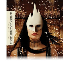
Each of my article title's are in "defused font" with explanatory text under each one in a similar font. All of these are in a white font as it stands out well on the black background. I also used a pink/redish font for some of the text because that is the text i want to stand out even more. The pictures in the middle of my table of contents are pictures to do with the articles, each one with a page number ontop of them so you can see which story they go with. Each of the pictures in the middile of an artist who is mentioned in the article each with a different redish/pink/purple glow appiled to them. This also makes them stand out from the black background
This is following some conventions to have pictures that correspond with the articles on your contents page.


Subscribe to:
Comments (Atom)