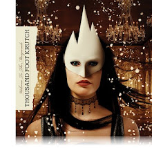
This is the website for Kick-Ass. The genre is different from mine though love does play a role in this film as too their being some kind of conflict. Despite the genre being different though, the target audience is similar. Both mine and their film are aimed at predominantly teenagers aged 15+ but also accessible and aimed at adults.
In terms of the film poster and it's conventions, The film poster has the name of the film as the main thing you see. It then has the main characters head's in the gap between the words kick and ass, changing from one to the others after a given time. The date is also in a big font so you know when it's coming out with the social networking buttons near the bottom of the page as are conventions of a movie website.
The trailer plays automatically, with the option for people to close it and actually enter the site. As well as following those conventions, it has a place when you can register for the mailing list at the bottom of the site.
In terms of being like the poster, it is very similar as it has the same grunge feeling. The characters heads are surrounded by spray paint as on similar posters they have.
 This is my plan for my website. It follows conventions because it has my poster as the main image. As with other conventions, my title is the biggest text on the page. The tag line is also there in a bigger size than most of the text.