
Here is my second draft of my table of contents.
For my table of contents i kept the same font for my mast heading. This is sticking with conventions and keeping consistency throughout the magazine. It is centred at the top of of my double page spread which is also following conventions.
For each of m0y articles i had them next to a symbol, this symbol was a font i found called "Button and swtiches" i used each one to go with a particular story. Each of these stories i made the titles slanted, this is a theme that i use in the rest of my magazine. This is breaking conventions. I am doing this so that my magazine stands out and shows that it does not act like other magazines.
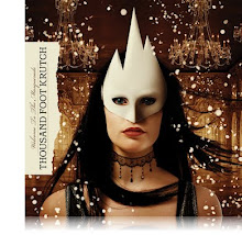
Each of my article title's are in "defused font" with explanatory text under each one in a similar font. All of these are in a white font as it stands out well on the black background. I also used a pink/redish font for some of the text because that is the text i want to stand out even more. The pictures in the middle of my table of contents are pictures to do with the articles, each one with a page number ontop of them so you can see which story they go with. Each of the pictures in the middile of an artist who is mentioned in the article each with a different redish/pink/purple glow appiled to them. This also makes them stand out from the black background
This is following some conventions to have pictures that correspond with the articles on your contents page.
No comments:
Post a Comment