Monday, 19 January 2009

Double Page Spread Analysis 2


1) How does the choice of band featured in the article suggest who the target audience will be?

The artist mentioned is kid rock, showing him attracts his fans, the target audience therefore are people who want to know more about him but also people who are interested in people who have survived in the business for as long as he has.

2) What type of language is used in the article? Give examples of words or phrases which are specific to the style of the magazine

Informal language, verbatim. The language is as if they are just writing down what happened in a conversation. “It’s Q’s round. What are you having?” The interview is very conversational.

3) How is colour used?

The colours are very simplistic. It uses blue and white as its main colours. The picture is a bit darker adding in black. The blue and white give the impression that this is just a normal conversation and pretty standard. The black in the picture is to show that there is a darker side to this seemingly nice interview.

4) What style of text is used? Is it similar to any other pages? What does it say about the image of the magazine and the audience?

5) How is the double page spread laid out? How much of the pages are taken up by images and how much by text? How does this reflect the audience? What do they value?

The double page spread breaks conventions. It has the text on the left and the picture on the right. Eye flow for a double page spread says we follow a c line from the right hand side to the middle of the left hand side then back to the bottom of the right hand side. This double page spread does not do this. The reader will naturally look at the right hand side first which is the image. The left hand side doesn’t do anything to try and drag the reader over there so the magazine must want the reader to mainly be focused on the image. The image has kid rock surrounded by two girls, this shows that he does like ladies and that added with the pull quote “If you date a pornstar, watch their movies. It’s like having a teacher’s notes in class.” This shows that a lot of the interview will be about that.

6) What tone is the magazine using when addressing the reader (as a close friend, a member of an 'in' crowd or an informed intelligent fan?) - provide evidence

The magazine is addressing the reader as a close friend, it is inviting tem to listen in to the conversation that they had. “Isn’t it hard to perform with another man in the room?” “well he wasn’t blowing me.” The text is very conversational.

7) How is the artist/band presented to the audience through the images? You may wish to carry out a textual analysis.

The artist is portrayed as a ladies man who REALLY likes girls around him and often has girls around him

8) How does the style of the article match the style of the front cover?

The photo’s are all both professionally taken and have the artist or lead singer as in the centre as the main attraction with their “supporting cast” surrounding them.

9) Does the article demand any prior knowledge? Give examples.

It does help if you know about kid rock beforehand but it is not needed as the article tells you enough about him anyway.

Friday, 16 January 2009

Double Page Spread Analysis


1) How does the choice of band featured in the article suggest who the target audience will be?

The band is a rock group who seem to be fairly new and upcoming, their audience would be people looking for a new band or people interested in rock (the people who read the magazine). Their style of clothes also appeals to teens and so do the colours used. This tells us who their target audience will be.

2) What type of language is used in the article? Give examples of words or phrases which are specific to the style of the magazine

Informal language, verbatim. The language is as if they are just writing down what happened in a conversation. It is an interview after all so the language would be as if it was a conversation because it is part of a conversation. The language itself isn’t even censored, it is as it was in the interview.

3) How is colour used?

The colours used are black white and orange. The black is used as it is one of kerrang!’s house colours. It is also an appealing colour to their target audience. The orange is used to make the text stand out. This s used for the interview questions. White is used for their answers which also stand out from the black background. Both white and orange contrast well with black and also contrast well with each other, thus why they are used.

4) What style of text is used? Is it similar to any other pages? What does it say about the image of the magazine and the audience?

The text is similar to the one used in the rest of the magazine but the page layout is different. This suggests that what’s in the articles are similar with each other but what they are about may be different. For example this interview is about questions about the band, another article is about how different bands feel about music. They both have the same target audience (thus the same font) but the design and layout is different (talking about different things). This tells us that the magazine constantly address’ it’s target audience and always gives them new and different things to read about. All of the text is sans and is very simplistic, this is used as arguably stand out more, it is easier to read for short amounts of text. This does also mean that more of the audience can read it and make it accessible to all of the audience who read it.

5) How is the double page spread laid out? How much of the pages are taken up by images and how much by text? How does this reflect the audience? What do they value?

This double page spread is laid out in a series of text boxes, each one linking up to a different member from the band like quotation marks. Each text box has the same questions in it with the band giving their own each individual answer. The image takes up the whole page with the text overlaying it. The audience value the look of the band and their image as much as they value the text because they both are shown and both giving equal priority.

6) What tone is the magazine using when addressing the reader (as a close friend, a member of an 'in' crowd or an informed intelligent fan?) - provide evidence

This address’ the reader as like a close friend with very casual language “I’m The One Most Likely To… fuck a sheep!” Here you can see it is just them talking. All the questions are informal as well “Girls love me…” “The most disgusting thing I’ve ever done on a tour bus is…”

7) How is the artist/band presented to the audience through the images? You may wish to carry out a textual analysis.

The image shows that they are edgy and rocky as they are jumping in the air and doing their own unique pose. The text also shows the audience their personality as it asks them all the same questions but they all say a different answer.


8) How does the style of the article match the style of the front cover?

It’s in your face, the colour scheme is quite similar, the pose the band makes it similar and also in your face. It’s extravagant and eccentric.

9) Does the article demand any prior knowledge? Give examples.

It requires some prior knowledge of who the band is as not all the readers may know them, but this interview is used for the reader and audience to get to know the band.

Thursday, 15 January 2009

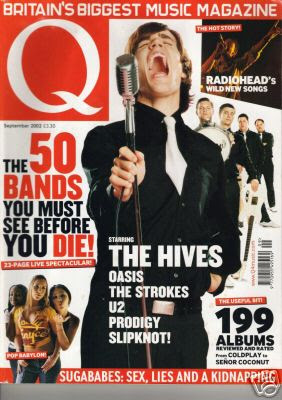
Q Front cover magazine analysis

What type of magazine is it?

It is an indie/rock magazine. It also features major pop artists (sugababes are on the cover of this one)

From the front cover what kinds of issues/articles are going to be inside?

“the 50 bands you must see before you die!” , there is going to be a chart on this in there. “199 albums reviewed and rated”, album reviews also will be inside.Who is the target audience for the magazine? What particular age group? What are their interests? How do you know all of this?
The target audience starts at people in their teens; its main audience though, are people in their late twenties and early thirties. You can tell this from the bands listed on the front cover, for example the front cover mentions “Oasis” and “U2”, their fans are in their twenties thirties and above. They do have fans in their teens but primarily late twenties onwards. The magazines images all are taken professionally (they were taken in a photo-shot rather than paparazzi pictures.) The colours used on the front cover are also black white and red, red is Q’s main colour and in their logo (so to is white) and is also a colour that their target audience like and find attractive. They also do like black and that attracts some more of their audience in.

What mode of address is the mag using? What does this tell you about the type of relationship it wants with its reader?

The magazine uses a very inclusive mode of address. “The 50 bands you must see before you die!” is addressing the audience and also will be interesting for anyone interested in music not just people who read Q, the same with “199 albums reviewed and rated” will be addressing anyone interested in audience rather than a specific one. Q has a very open relationship with its readers, the articles it features will interest its main audience but will also include anyone else which gives them the chance to increase their audience

Who is on the front cover and why?

The Hives are the main “model” on the front cover. They are features on the front cover possibly because they have an interview inside the magazine, but probably because they feature very high in Q’s chart about bands to see. Have the sugababes on the cover with a bar on the bottom reading the cover line “Sugababes: Sex, Lies And Kidnapping.” ; This will be an article in the magazine thus why they are on the cover. It also features radiohead in the top right hand corner, the picture is them performing at a gig, so they feature an article about them in my magazine.

What does the main cover line say? What does this imply about the artist/band?? What overall message is the artist/band giving?

“THE 50 BANDS YOU MUST SEE BEFORE YOU DIE!" This implies that the bands mentioned in this chart have amazing gigs, the artists on the front cover “the hives” must be in this chart and very high in it seeing as they are the main model on the front cover. This gives the message that they should be seen performing live while you can because, according to Q, they are good.

Are there any ‘buzz’ words? What effect does it have on the reader?

Die!” is a buzz word, with the word before in front of it, it gives the implication that this is urgent, also die makes whatever this is very serious. Die is also written in red, compared to the black font most of the other cover lines are written in so it makes it stand out more, plus, it has an exclamation mark at the end to further make it stand out of the page.

Is there a strapline/selling line/slogan? What does it tell you about the magazine? How does it help to attract readers?

“Britain’s Biggest Music Magazine” This tells you that this magazine is a good magazine and the rest of the British public think so, if it is the best in Britain then the audience will trust that what’s inside will probably be very valuable music information to them.

What strategies does the magazine use to attract the audience?

The magazine mentions big artists the audience would like, extreme and attention grabbing cover lines to primarily attract its audience. The language used is inclusive so it will include anyone interested in music.

Tuesday, 13 January 2009

Kerrang! Front Cover Analysis

What type of magazine is it?

Kerrang! is a hard rock and metal music magazine.

From the front cover what kinds of issues/articles are going to be inside?

The front cover shows Ville Valo on the front cover with the cover line saying “The Amazing Resurrection Of Ville Valo” so the magazine will feature something about him inside. It also lists more bands down the side, this shows there may be interviews or reviews or something about them inside the magazine as well.

Who is the target audience for the magazine? What particular age group? What are their interests? How do you know all of this?

The target audience for this magazine would primarily be teenagers (mainly those 16+) and also those in their 20’s. Some of its audience would be around their 30’s (the same age as the people featured in the magazine). You can tell that the target audience is mainly teenagers because the bands featured in this magazine have got mainly teenage fans, and also the title itself appeals to teenagers and people in their late 20’s (the design of it is edgy which appeals to them). From the front cover we can only see that their interests are mainstream rock groups. The front cover has a header listing some mainstream bands; the main image on the front cover is of the lead singer of a mainstream rock group, and on the side they list other mainstream rock groups that are going to be in the magazine and also are advertising that they have posters of yet more mainstream rock groups. If we wanted to find out any more of their interests we would have to look inside the magazine at the table of contents.

What mode of address is the mag using? What does this tell you about the type of relationship it wants with its reader?

The magazine’s mode of address appears to be exclusive to people who either read the magazine or listen to the bands mentioned on the front cover. This tells us that the magazine caters to its audience, and only the audience they regularly get. They aren’t trying to increase their audience by including more articles about wider things; they are just giving their audience what they want.

Who is on the front cover and why?

Ville Valo is on the front cover; from the main cover line “The Amazing Resurrection Of Ville Valo” we can assume that he is making a comeback of some sort. He is the lead singer of the band HIM which is a mainstream rock band who Kerrang!’s readers would like. Their target audience would be interested to read an interview about him and about his comeback.

What does the main cover line say? What does this imply about the artist/band?? What overall message is the artist/band giving?

“The Amazing Resurrection Of Ville Valo”. This implies that the band “HIM” are coming back, seeing as he is the lead singer of the band. The word “resurrection” suggests that they are making a comeback but also the idea that they died first or something like that.

Are there any ‘buzz’ words? What effect does it have on the reader?

“Resurrection” is the only buzz word on the front cover; it has more than one meaning when used here. As mentioned before it implies a comeback but also resurrection (as mentioned before) suggests that the band have died before.

Is there a strapline/selling line/slogan? What does it tell you about the magazine? How does it help to attract readers?

“Life Is Loud” is the strapline for the magazine. This tells you that the magazine definitely does music, the word loud could also imply that they do a LOT of music, thus why it is loud. It also suits the genre of music that is inside kerrang!

What colours are used? Do you find them attractive?

Black and white are the main colours used, I personally do not find them attractive but does are colours their readers like and enjoy

Monday, 12 January 2009

Thursday, 8 January 2009

Mood Board

My Mood Board for my music magazine, a collection of images and fonts which will help me in my music magazine.